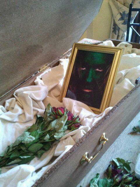
This is a shoot of the 7 Deadly Sins taken from Season 4 of America's Next Top Model. I like that they have all been placed in coffins as the sins are a bad thing. The original images are larger than this, but they have been cropped to fit them all together. The images each have their own styles and colours that are related to the sin they are portraying. Having a specific colour or prop in the image makes it memorable. I like that all of the images have the same background, and it's just the colours that change. The lighting in each image is the same, they all highlight the models face. The light highlights this and gets gradually darker towards the bottom of the images, giving the effect of darkness. The photographer for this shoot was Johann Wolff.

Image from - https://blogger.googleusercontent.com/img/b/R29vZ2xl/AVvXsEggzzzbd3dgGllPvBo514243_9LRMgxSAMT-vron3i35jjFhKAZimjkTv8J2pHTjIpgp2Hx_MBl6aUfMKLNV-gxZ4St7_T7HkXPfEIV3m9oe8HyGcwmJo2izuZj7E8LSeXXv1KLp82TB7MF/s1600/ANTM-america-27s-next-top-model-40987_900_675.jpg
Here the sins have been portrayed completely differently to the images above. They are dressed differently, suggesting that they are something to be proud of. The photographer for this shoot looks like s\he has told them to look regal and upper class. The ornate designs around the women also accentuate the regal feel. The lighting in this image is brighter, as the Top Model shoot is darker as they were 6 feet underground and put in a coffin. As you can see each model has either a colour or a prop that associates with their sin. I think that this is a good way of assigning a sin as when you think of anger you think of red, as it is a sign for danger or a warning. It is also a clever way of making people remember the image.
Image from - https://blogger.googleusercontent.com/img/b/R29vZ2xl/AVvXsEjBAIoU0vf2Z81-1i4GqBrN130Q6iF_Y7n8gLhweh2Dl2TA71e4rks04pOiREPUk9idsxS0tO9FfM9hbyNOK5PMBkZvMkc6DwqtM2bFSEq_RXQa4XKOxrNXBuwpcWYBX5vQWYCyJ2NgInLI/s1600/7deadlysins1.jpg
This is an example of what I could do with my work. Here the creators of this image have decided to put the definition of Lust next to it just incase people are not familiar with the Deadly Sins. I think that this is a great way to inform people about the sins. I like that text has also been used in the image, although in this particular photo, the text would've looked better if it was more ornate. The image of the woman is from the previous image. The placement of her in the photo is very seductive, grabbing her neck and pulling on her chest.
Image from - http://feasttofamine.files.wordpress.com/2010/12/lust.jpg
The image below represents Sloth. I love how the girl has been placed to look like a broken doll and to look lazy or asleep, almost looking unconscious. I plan to take elements of this image and use them to do my version of Sloth. I am going to have the girl sitting slobbing on the sofa. In this image you can see soft creases in the photo. Almost like it has been taken with a film camera, processed, scrunched up and scanned into a computer to give it that crumpled effect. The colour scheme of this image is almost sepia like, but it does cross over with a monochromatic scheme. I will probably use this faded monochromatic colour scheme in my image to show help give the effect the the girl is fading away and decaying.
Image from - http://astrologyunboxed.com/wp-content/uploads/2011/06/sloth-3.jpg
Image from http://l.yimg.com/l/im_siggmxIl0bcPlGaHiVYCtnKgWg---y626/tv/us/img/site/74/86/0000047486_20080320110308.jpg
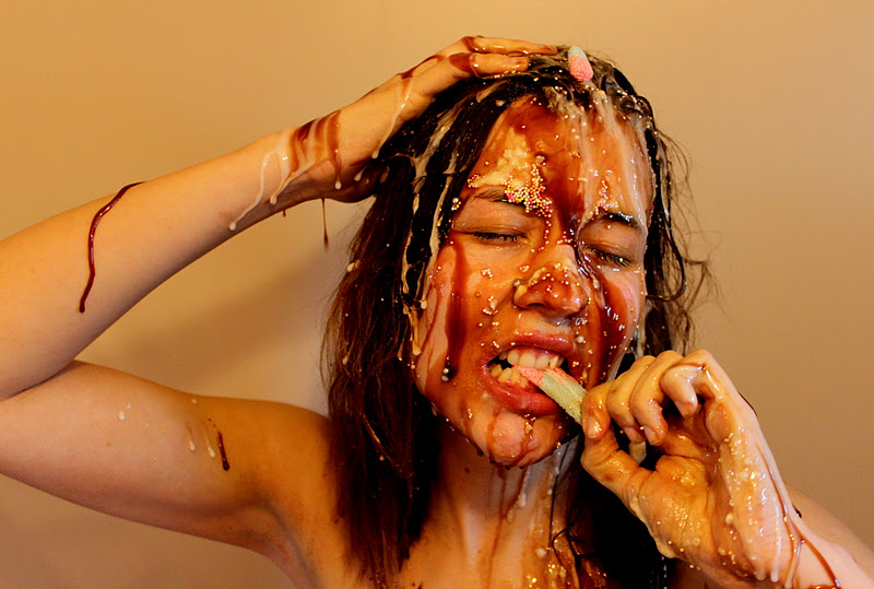
This photo is from season 10 of America's Next Top Model. It was taken by Peter Buckingham. I plan to take inspiration from this for my gluttony shoot, but instead of there being paint over my model she will be covered in fudge sauce and chocolate and sweets. I love that the paint is dripping down the model, and I hope that this is what happens when I use the confectionary for mine. I like that the background of this image is plain, and I am going to use this idea as well in my image. I don't think anything should take away from the main object.
Here I have made some mood boards to suggest what I could put in my images. These are to help me come up with ideas and inspiration for the shoots.
The theme for Lust is going to be Moulin Rouge/Burlesque. I wanted to use this as a theme, as the women in Moulin Rouge were to be desired and longed for by the men. I want to use this and make it more sexy rather than knowing that they are dancing for men. I plan to use a corset, stockings and heels to create this look, whilst shooting in a gothic style bedroom. As you can see in all of these images, red has been a focal point in the image. Red giving the connotations of lust, love, but also the passion that is involved in lust.
For my Wrath shoot I am going to have my model dressed in black, just in a top and leggings. I am going to put her on a white background, and behind there will be words describing the anger she has. I want the image I use to look more sinister rather than screaming like these photos.
Here there are a couple of images with a narrative, and also a few with green in. The green depicts the colour of envy, giving the images a feel of jealousy. The way the woman with the snake is placed, represents her as a regal figure, but looking at her eyes you see her staring down at someone, giving them evil eyes. The snake looks almost like a pet, but it also looks like it could be used as a weapon, as the snake is being controlled by the woman. The smaller images show a narrative, of people being jealous of other peoples relationships, something which is very common and also a common cause of envy. The sepia image gives the feeling of an old love story. The lighting on the top left image is darker over the girl who is envious of the couple. The couple have light from a flash above their head, and the other girl doesn't. This could show that the envious side is bad.

I have decided to research the characteristics of Sloths to find out how my model should act. I found that they are extremely lazy, and have virtually no capability of moving at speed. Sloth's were also
very dumb creatures. All of the images here show the model being placed into a slouched position or they're lying/sitting down.
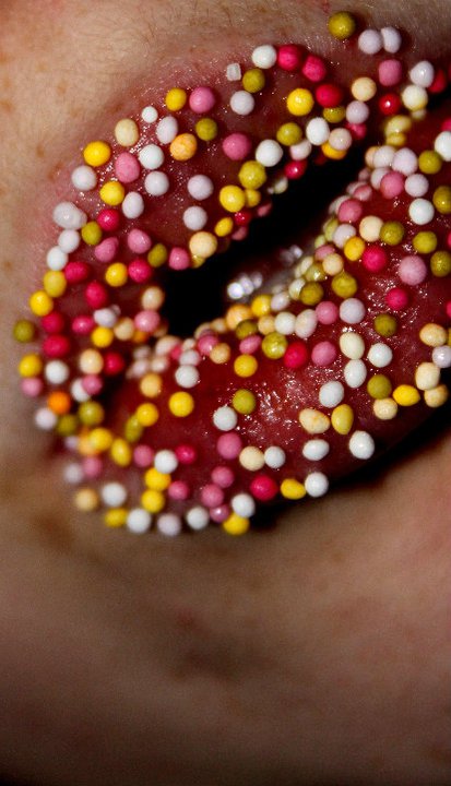
 For my Gluttony shoot, I am going to have a close up of my model on a plain or brick background, I am then going to cover her in toffee sauce, sweets, and other confectionery. I might also blow flour onto her through a straw to give a different technique. It will be a very light photo so that you can see everything in the foreground. These images show the model being covered in food, and gauging into food. I like that the image on the bottom left might show a girl who has an eating disorder and is tempted to binge on fatty foods but can't and is restricted.
 These images show a sense of Pride through different ways, from a teenage aspect Pride could be seen when someone has won a title such as Prom Queen, or won an award of some form. Also Pride can be seen as vanity, being obsessed with themselves trying to make themselves look perfect, showing they have Pride in themselves. The other image although is more serene. Having the man positioned with his eyes closed and just hold up an open hand is very calm. The colours here represent the LGBT (Lesbian Gay Bi-Sexual + Transgender). The open hand shows that the person doesn't want to fight, as if he was fighting for LGBT his fist would've been closed like he was ready to punch.
 These images all show Greed as a thirst for wealth, an unnatural desire for money. Two of these photos show a happier side of Greed, whereas the other is like the model has been caught in the act of stealing money. The lighting in all the images is fairly light, with hardly any shadows.
Review of Research
I searched various websites and Photographers to help me during my research. I decided to use images that would inspire me and give me a challenge. In my research, I have found various ways in which I can experiment before I do my final piece. I have decided that I am going to experiment with colours to portray my sins, especially for Envy. I am definitely going to be using green, maybe face painting someone green and using a close up or an extreme close up. For Lust I am going to use the Moulin Rouge style to portray my sin, but I think I will experiment whilst on the shoot for my final image rather than doing two separate shoots. I have learnt that the message of the sin doesn't have to be in your face, for example, on the Pride image, there is a photo of a man with a rainbow painted on his hand. This image to one person could just be a man with a painted hand, but to another it would represent the man's Gay Pride.